Discovery Redesign
Rethinking the core product experience to help users find and buy live events faster across web and native.
Overview
Goldstar's mission is to get people out more often by giving them access to discounted live events, theater, concerts, and more. But the platform was struggling with engagement — a large percentage of users were bouncing because of an unengaging, feed-based interface that wasn't doing its job.
As lead product designer, I was responsible for redesigning the core product experience across web and native. The goal was to move away from an interaction-heavy feed and toward something that immediately connected users to the breadth of inventory. That meant a full information architecture revamp, rethinking user interaction patterns, and comprehensive testing to make sure the redesign actually moved the needle on engagement and conversions.
The Problem
The original app was built around a feed that relied on user interaction — likes, purchases, social connections — to surface relevant content. If you didn't interact much, the feed showed up empty or irrelevant, which led to high bounce rates and low ticket purchases.
The core issues were:
- Low engagement and high bounce rates because the feed wasn't serving useful content
- Poor event discovery, causing people to leave before they ever made a purchase
- An outdated interface that hadn't kept up with what users actually needed
We needed to rethink the interface and completely restructure the IA so users could find events and buy tickets without friction.
The Approach
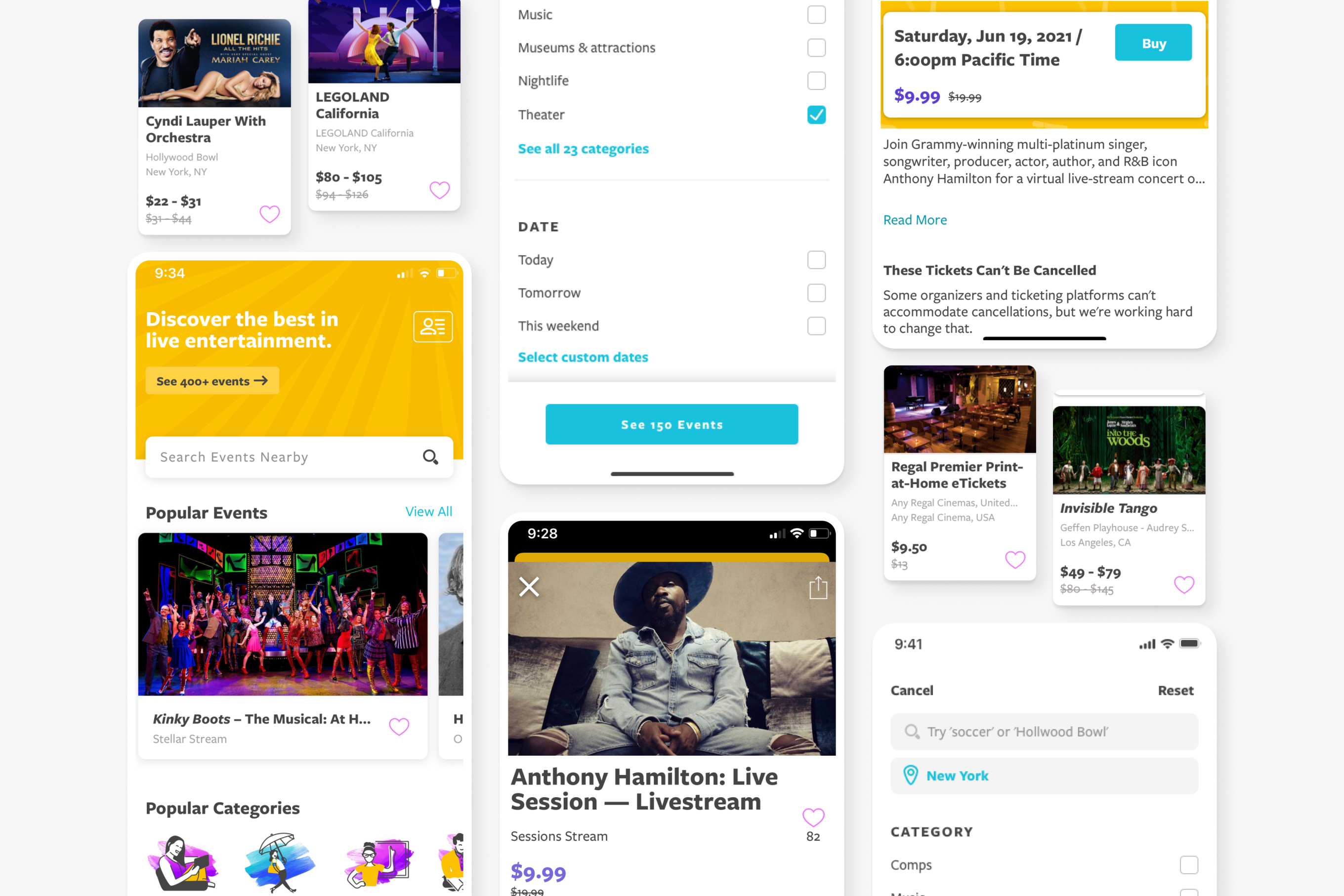
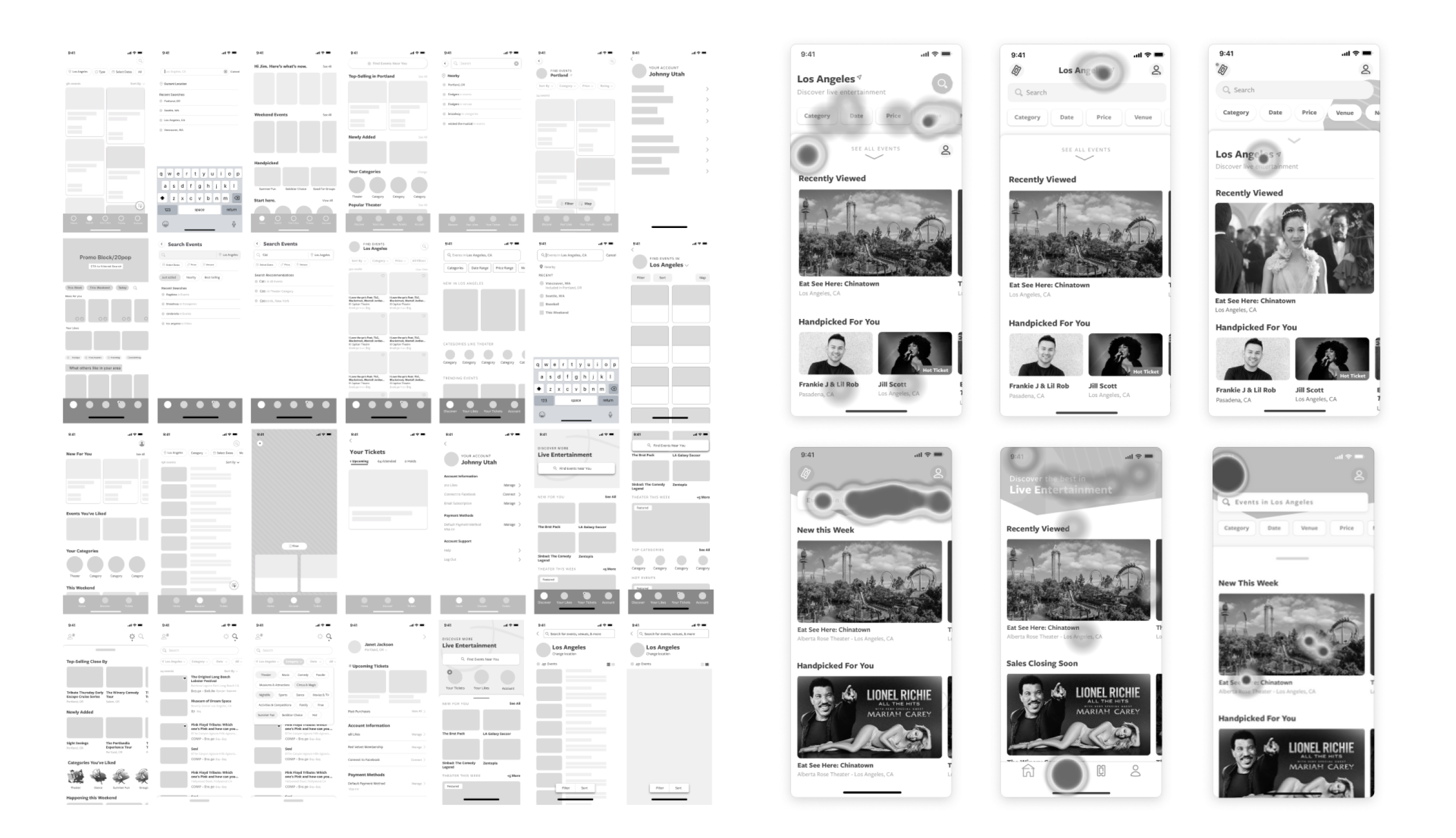
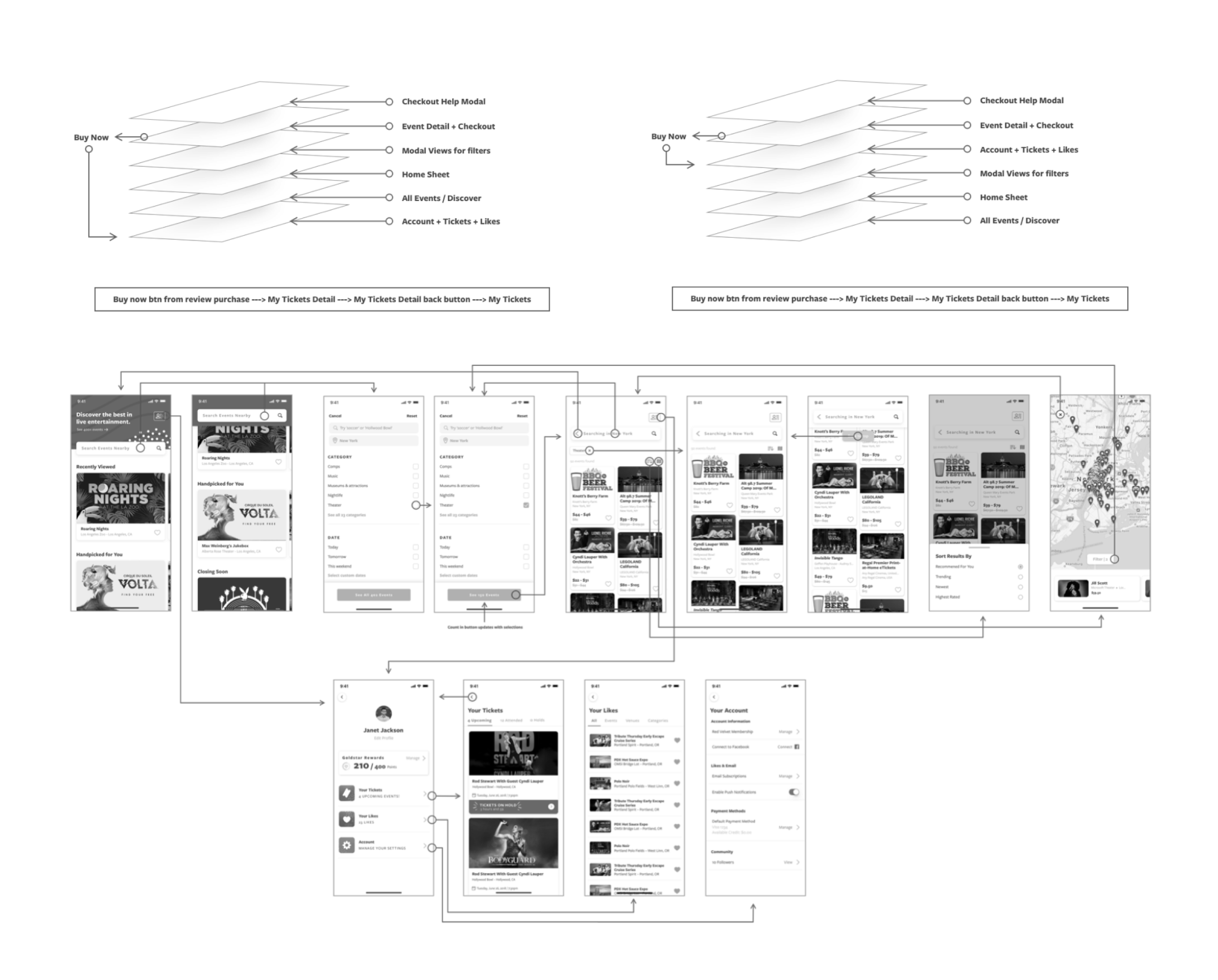
We began with a comprehensive audit of Goldstar's existing app and website, mapping every user flow and identifying friction points. The feed-based architecture was replaced with a category-driven discovery model that surfaced events based on location, interest, and availability — ensuring every user saw relevant content from their first session.
We ran rapid design sprints to explore and validate new interaction patterns. Each sprint produced testable prototypes that we put in front of real users, allowing us to iterate quickly and converge on solutions that measurably improved task completion and discovery rates.
Testing spanned the full fidelity spectrum — from paper prototypes and wireframe walkthroughs to fully interactive high-fidelity prototypes. This layered approach let us validate structural decisions early and refine visual and interaction details before committing to development.
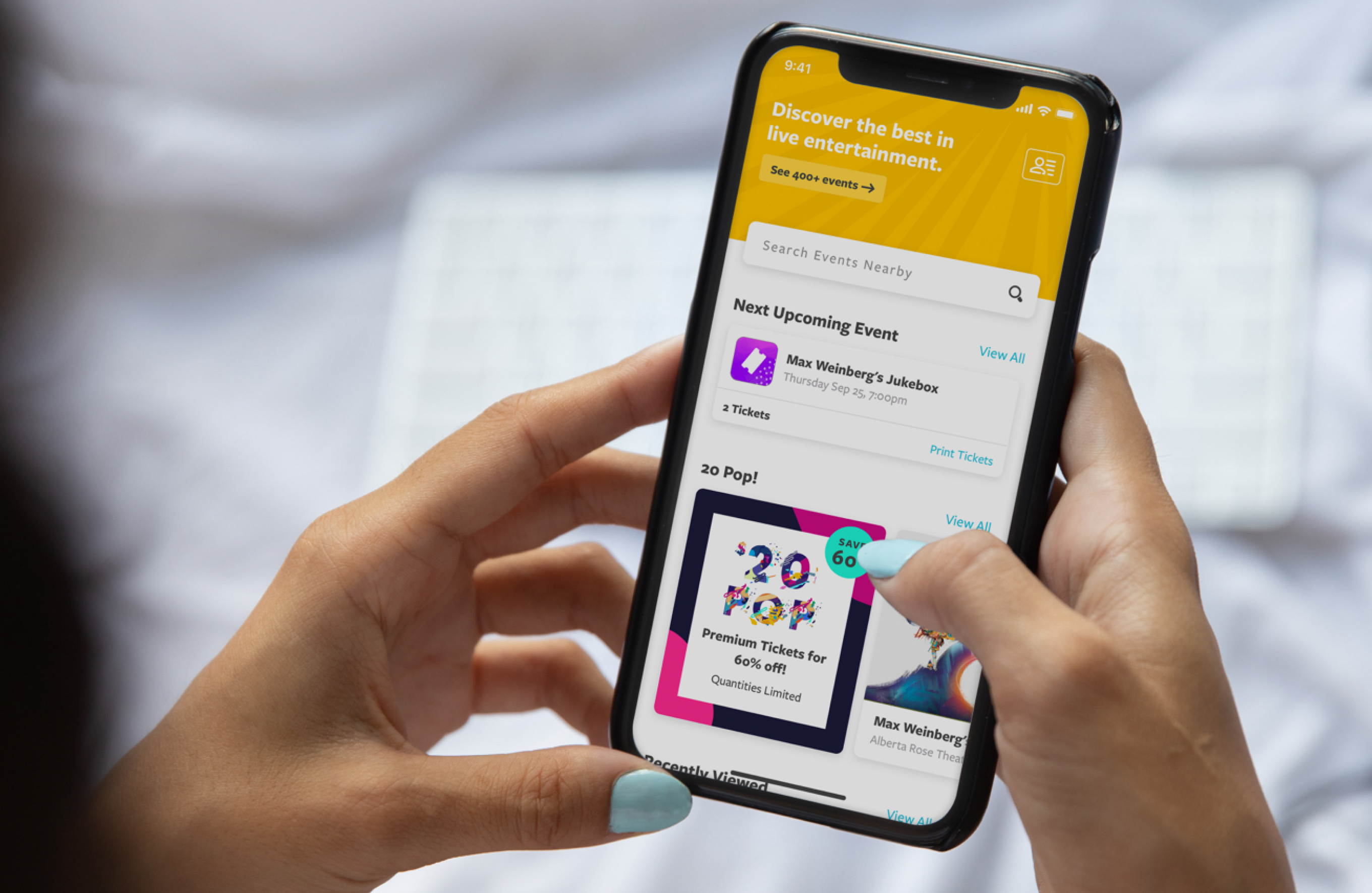
With validated layouts in place, we focused on micro-interactions and transitions that made the experience feel polished and responsive. Thoughtful animation on card reveals, page transitions, and search interactions added a layer of delight that reinforced Goldstar's brand personality.
Search was reimagined as a first-class feature. We introduced keyword-based filtering, trending searches, and contextual suggestions that helped users find events faster — reducing the average path to purchase and significantly increasing search-to-ticket conversion rates.
Results
We did a slow rollout — native first, then desktop, and tracked everything through Google Analytics over two months. The numbers were significant:
- Event page views went from 1.4% to 23.4%
- Selected tickets jumped from 0.5% to 9.7%
- Purchased events rose from 0.1% to 2.9%
The streamlined flows, better interaction design, and improved discovery made a real difference. It exceeded what we were expecting and gave the platform a much-needed reset.