Sequoia's Townsquare
Redesigning the internal hub where Sequoia's investors access market insights, collaborate, and stay connected across desktop, mobile, and native apps.
Overview
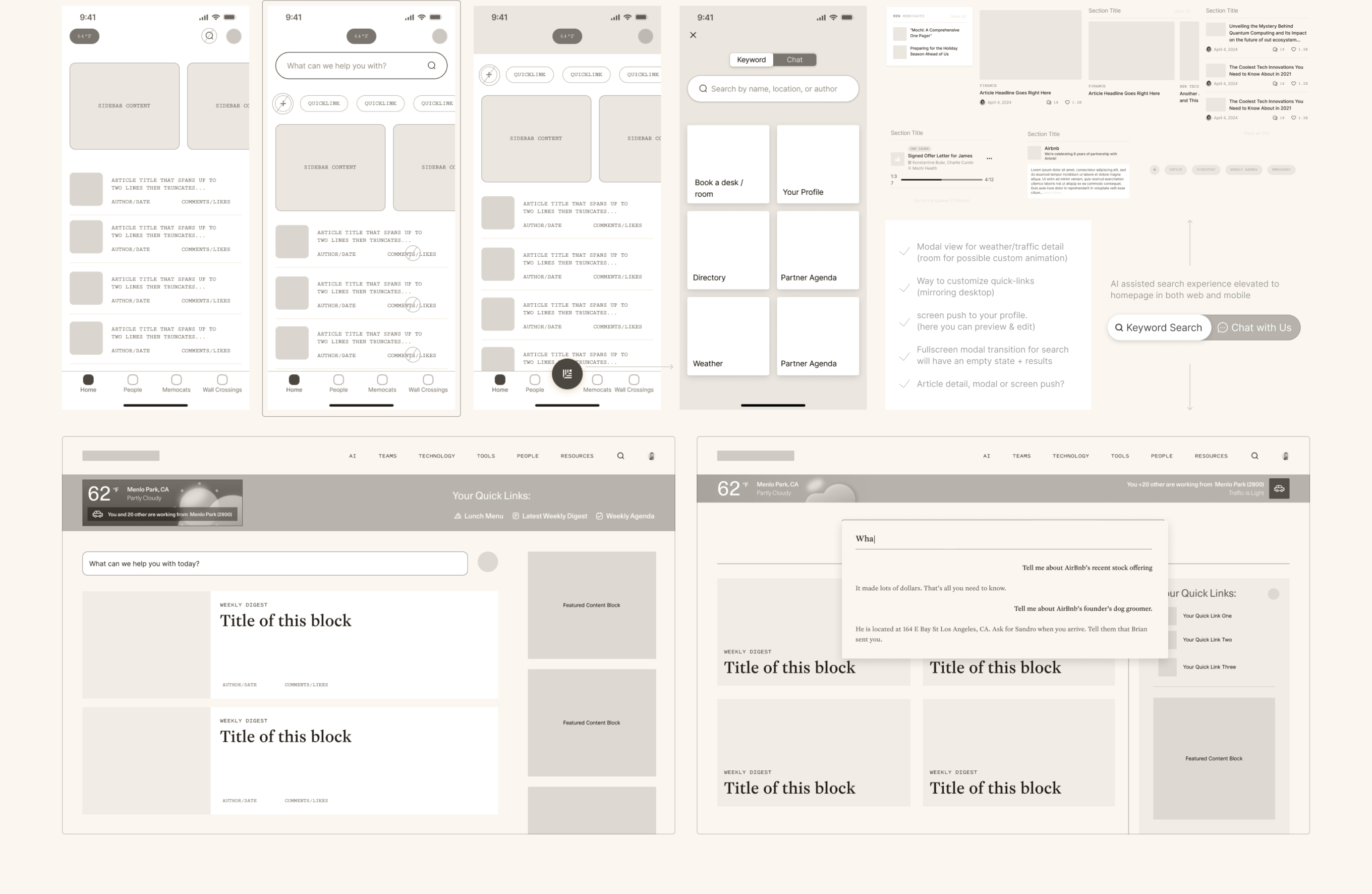
I worked with Sequoia Capital to redesign Townsquare, their internal app for investors and employees. It's where people go to access market insights, project details, meeting schedules, and partnerships. A desktop MVP had been wired up, but the information architecture needed work and there was no mobile or native app experience yet.
The Problem
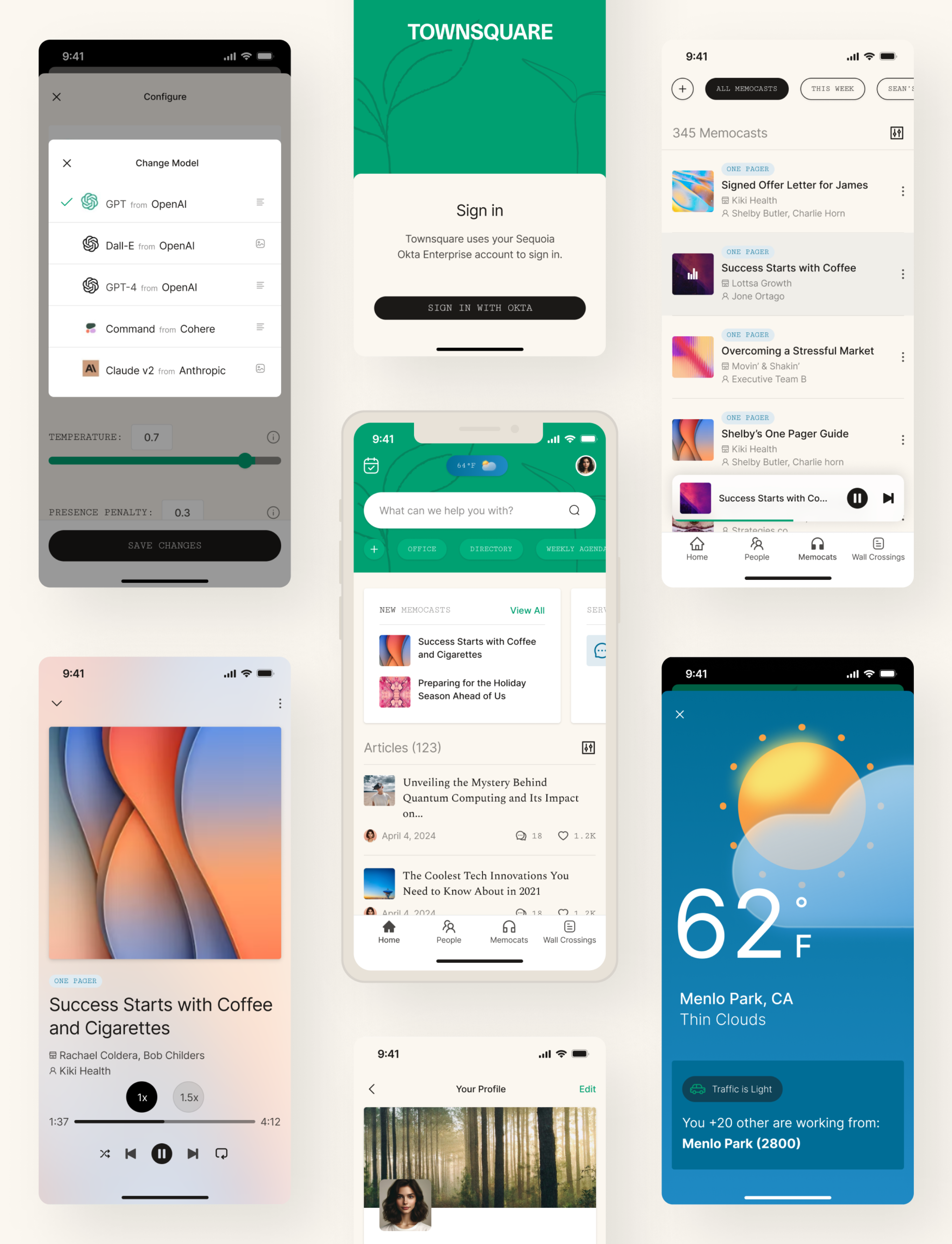
After gathering feedback from several key investors and stakeholders, it was clear that Townsquare was missing a core use case: mobile. A lot of these investors aren't sitting at desks all day — they're on the move and relying on their phones to stay connected. Without a mobile version, the platform just wasn't getting the engagement it should have been.
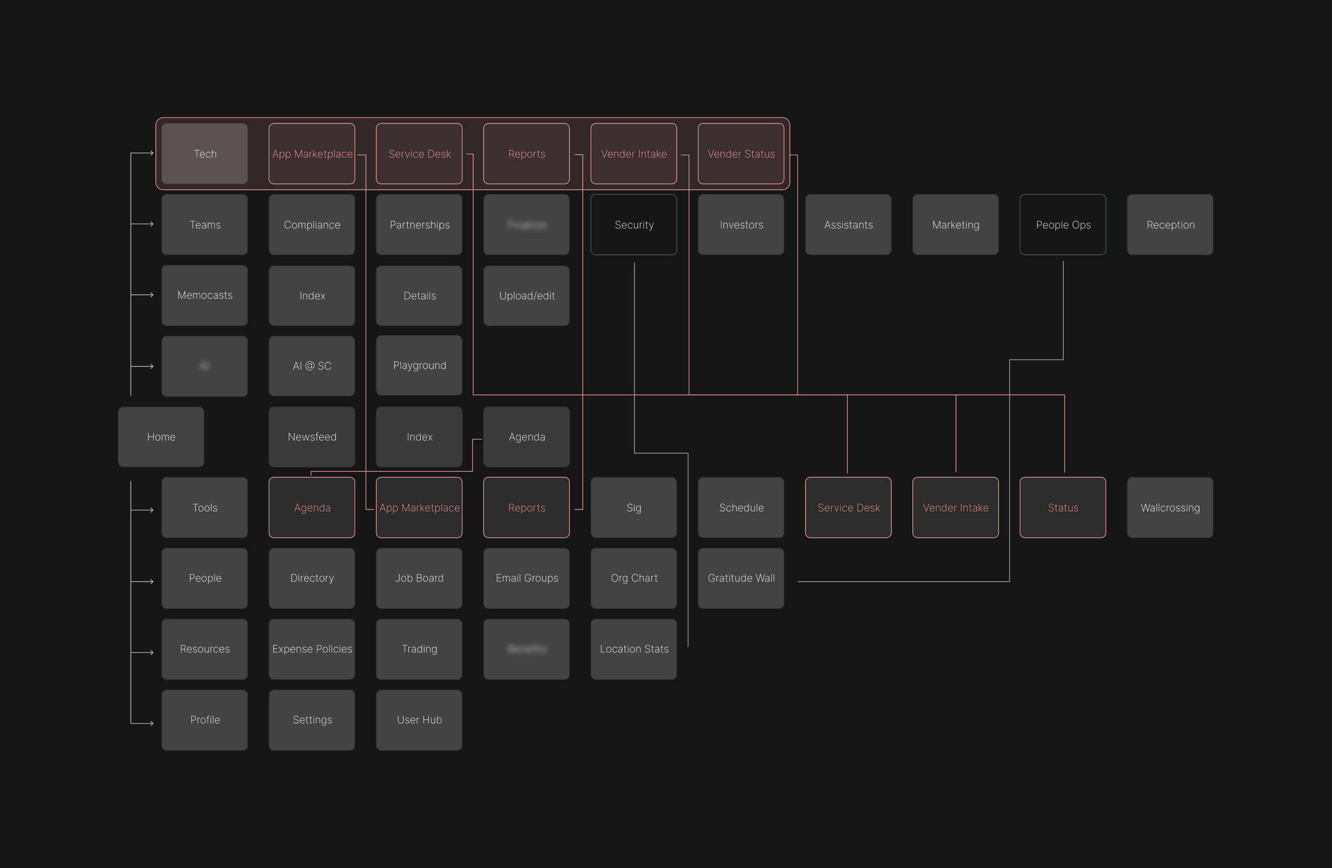
On top of that, the desktop experience had its own issues. Redundant navigation patterns, underutilized features, and a structure that needed a full audit to clean up and refocus.
The Approach
I led design on this one, working with a tight team — a tech lead, PM, and a few frontend and backend devs. We followed a user-centered process, leaning on feedback throughout:
We conducted interviews with key investors and internal stakeholders to understand their daily workflows, pain points, and feature priorities. This research surfaced the critical need for mobile access and helped us align on a shared vision for Townsquare's evolution — ensuring the redesign addressed real user needs rather than assumptions.
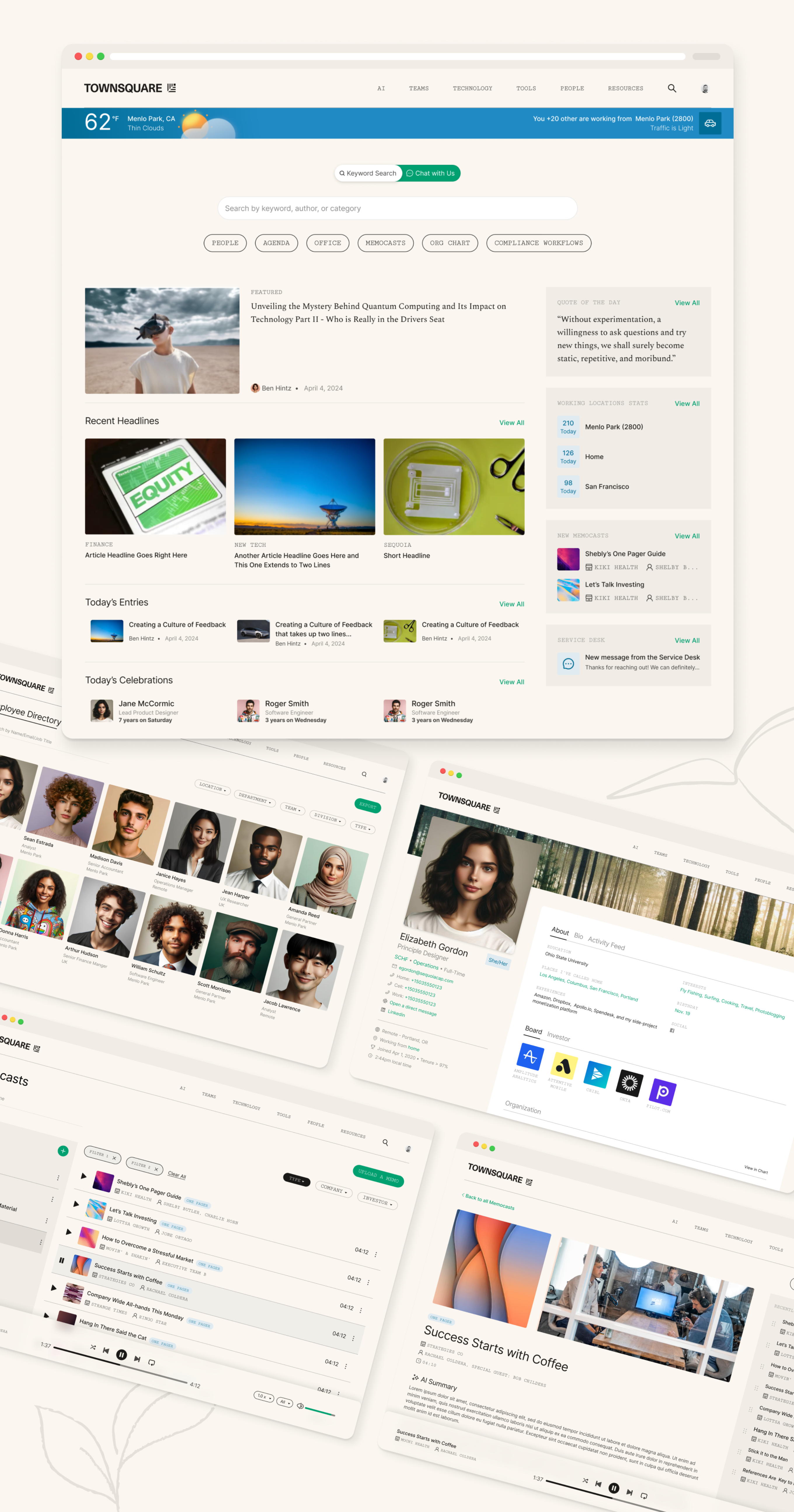
A full audit of the existing desktop app revealed redundant navigation paths, underutilized features, and an information architecture that didn't scale. We restructured the IA to reduce cognitive load, consolidated navigation patterns, and created a hierarchy that surfaced the most critical tools — market insights, meeting schedules, and partnership details — within one or two taps.
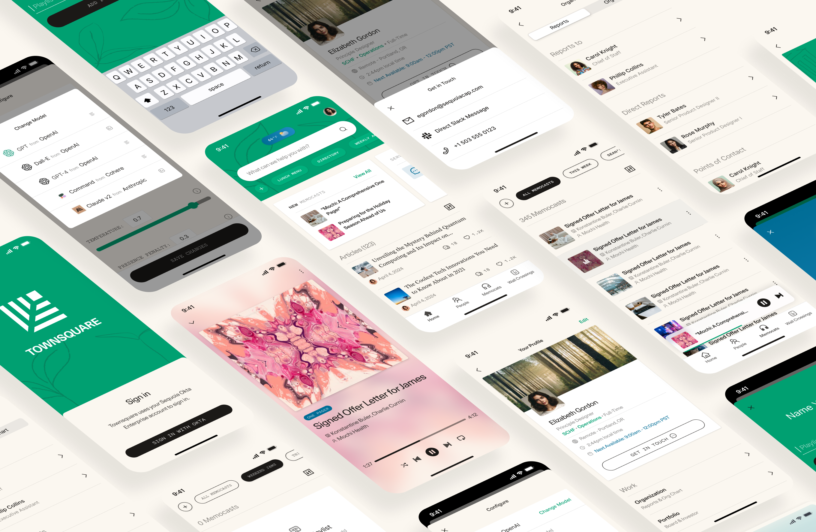
With a refined IA in place, we designed a mobile-first experience that translated Townsquare's core functionality into native iOS and Android patterns. The mobile app prioritized quick access to memocasts, people directory, and real-time notifications — features investors relied on most when away from their desks.
The existing desktop UI felt dated and inconsistent. We overhauled the visual language — refining typography, color, spacing, and iconography — while staying true to Sequoia's brand identity. The result was a cleaner, more modern interface that felt cohesive across desktop and mobile, elevating the platform from an internal MVP to a polished product.
Rather than leaving the redesign as one-off screens, we codified every new pattern into Sequoia's existing design system. Reusable components, tokens, and layout patterns were documented and built so that future features could ship faster and maintain visual consistency without requiring design review on every iteration.
Challenges
- Maintaining feature parity: Getting all the desktop features to work in a mobile context wasn't straightforward. Some things had to be completely rethought to make sense on a smaller screen.
- Tight timelines: The scope was big and the timeline was not, so staying aligned across the team was critical to shipping quality work on time.
- Balancing simplicity and functionality: We were constantly iterating on how to simplify the interface without gutting the depth of what investors actually needed. That meant a lot of back and forth with users and stakeholders.
Outcome
The redesign addressed the biggest pain points that came out of research. The mobile launch drove a 5x increase in investor engagement, and the cleaned-up desktop experience saw a real bump in feature adoption — especially around the People Directory and AI Workshop. We also built out a cohesive design system that made it easier for the internal team to ship updates going forward without things falling apart visually.